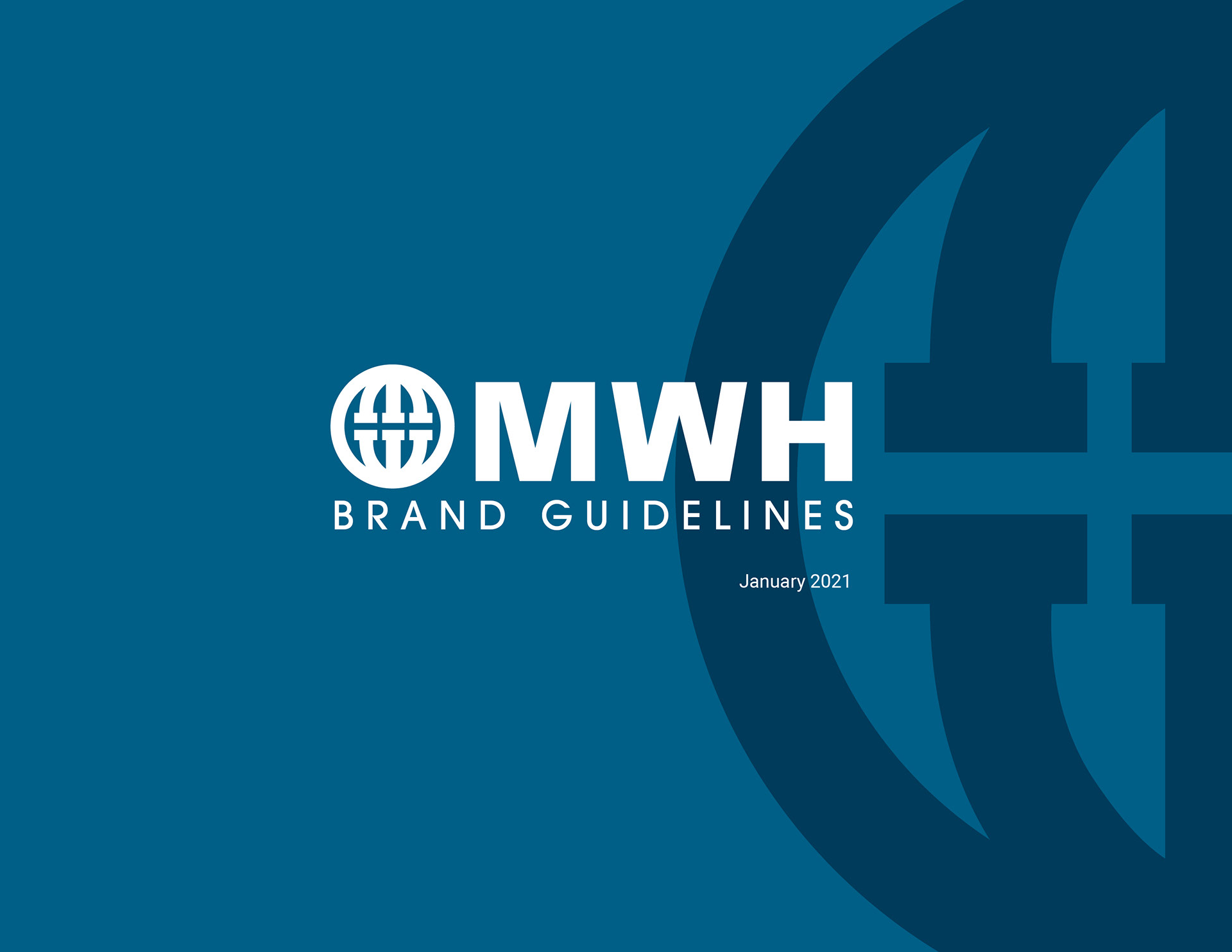
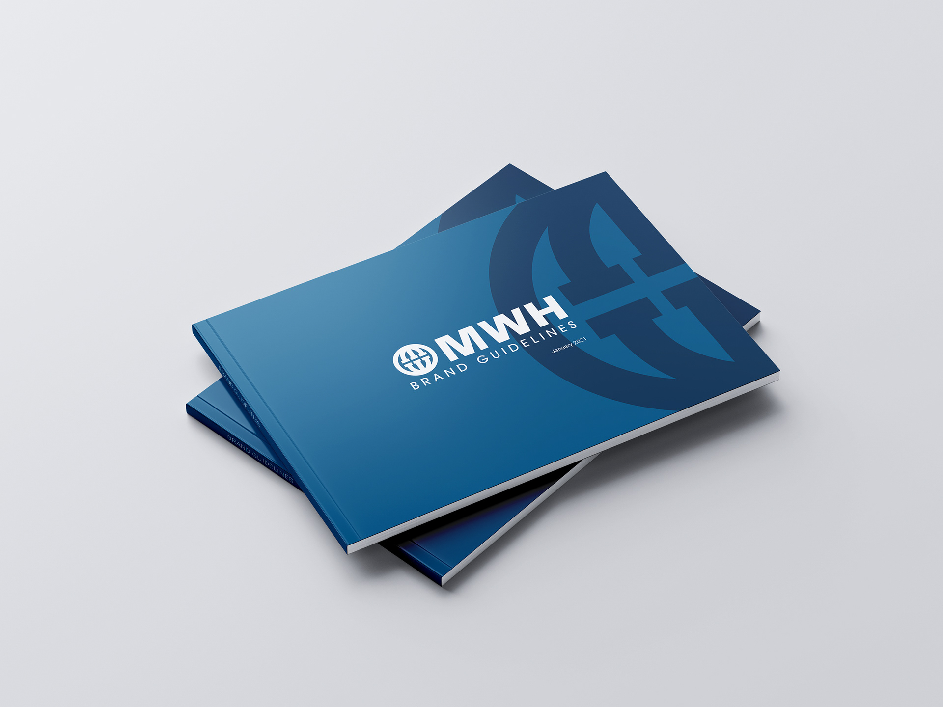
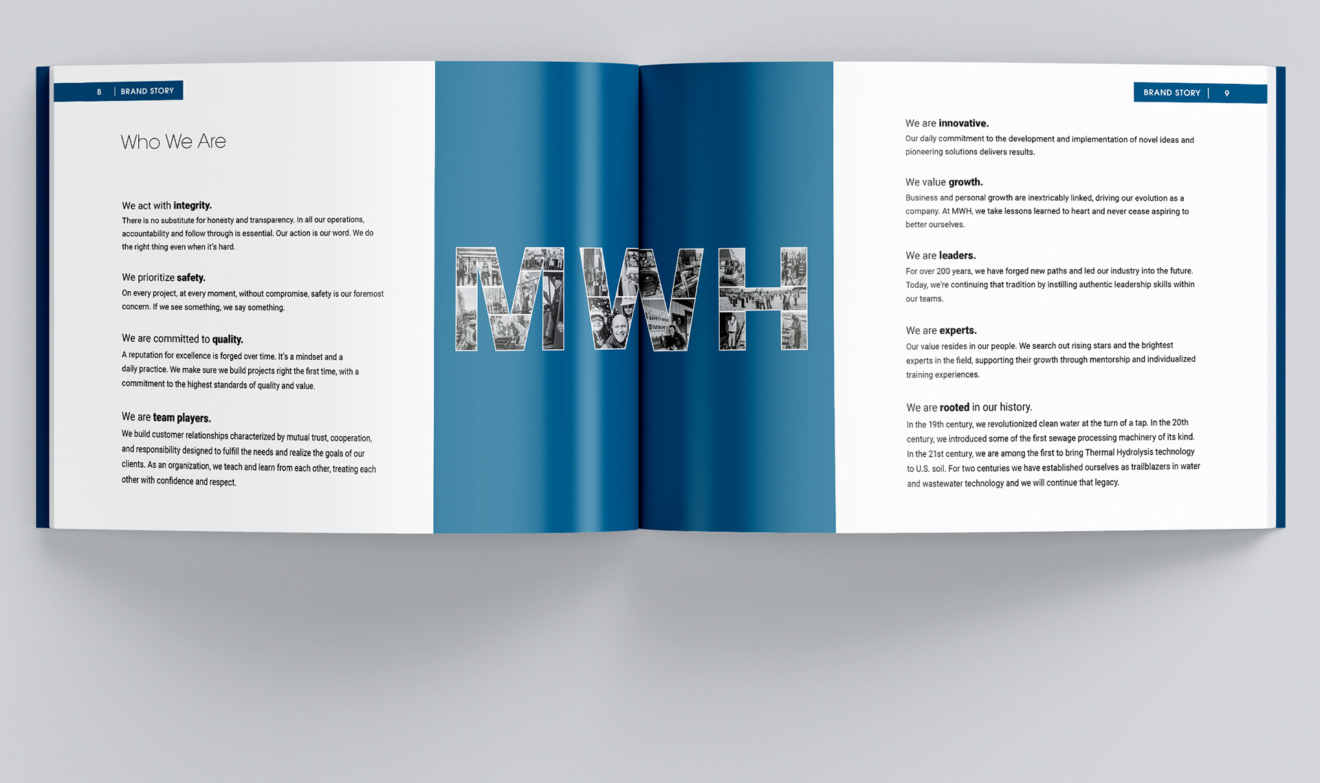
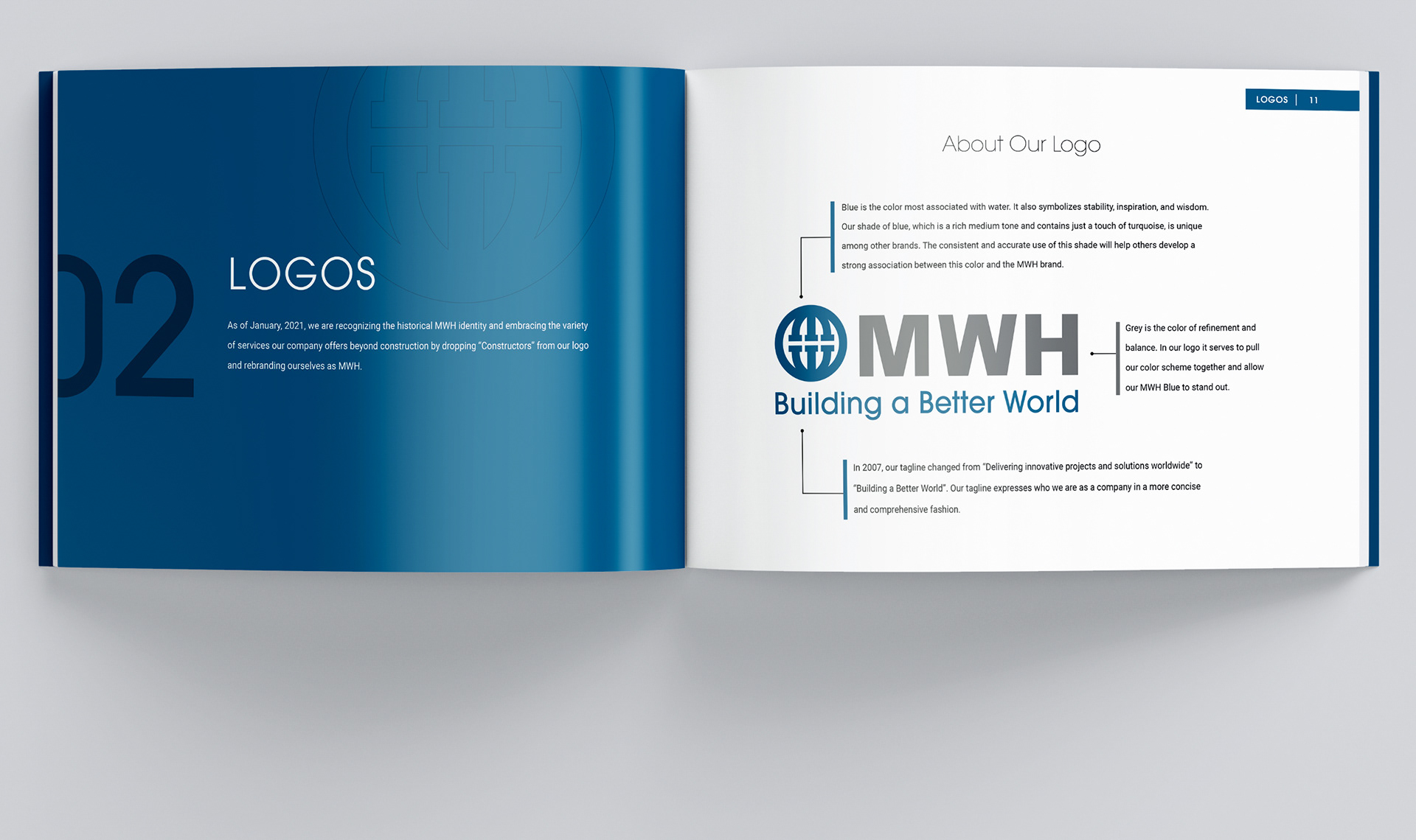
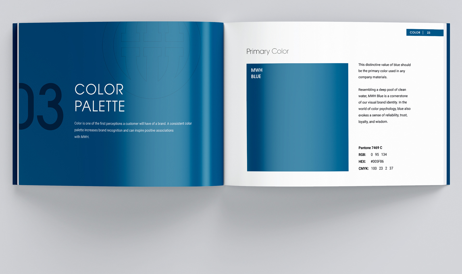
When MWH Constructors made the decision to drop "Constructors" from the logo and represent their brand as MWH, there was also a desire to simplify the color palette and create a brand identity that encompassed not just design, but also the personality, brand story and brand voice of the company.
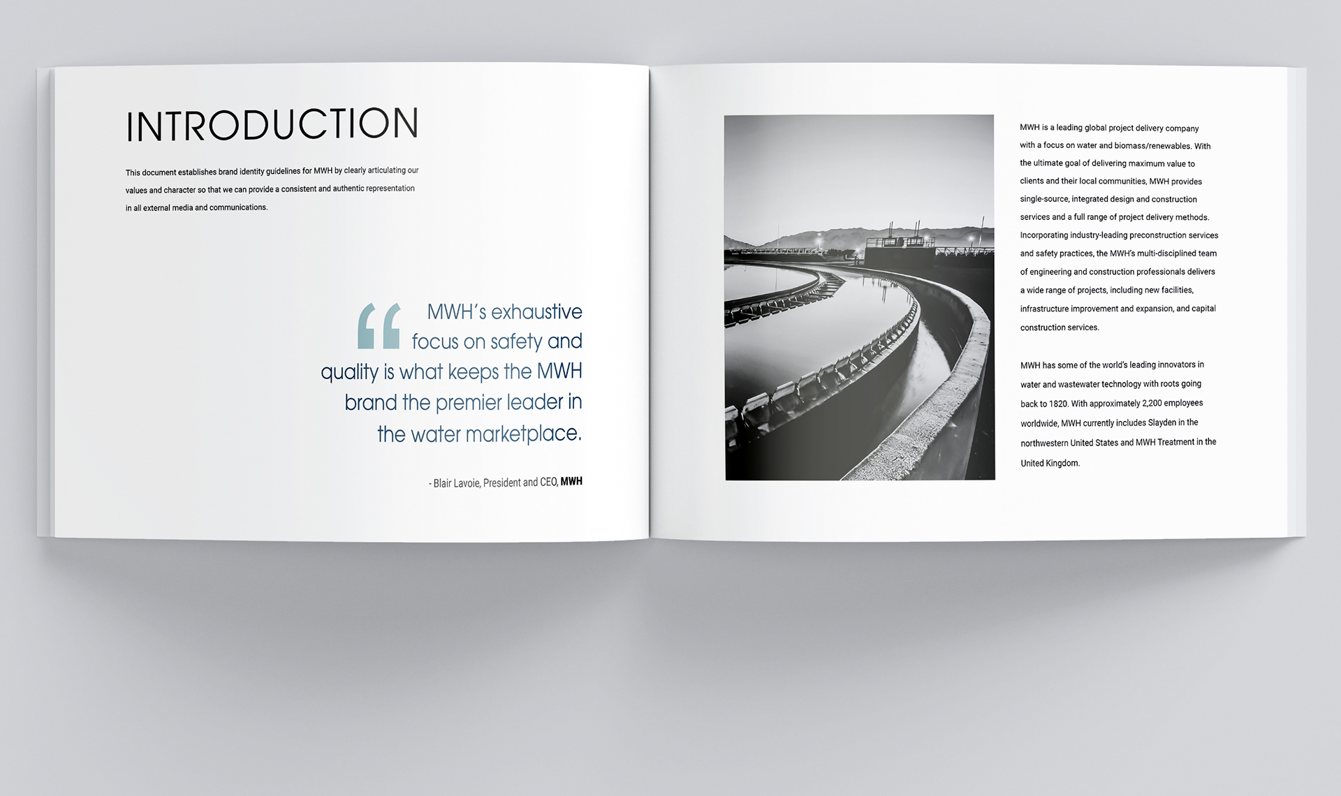
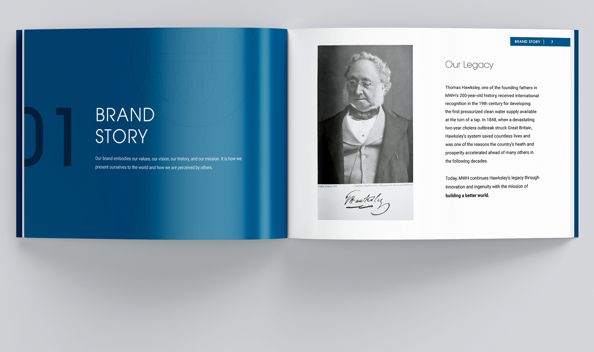
To take on this project, I took a deep dive into the vibrant history of this 200 year old company and reviewed the evolution of their brand, identity, and logos. My goal was to create a timeless identity that would be straightforward for 2000+ employees from diverse backgrounds to embody. I wanted to offer a more holistic take on past style guides that focused primarily on design.
Additional Information:
Project Type: Branding, Brand Guidelines, Brand Manual, Brand Identity, Style Guide, Graphic Design
Tools: Adobe Creative Suite
Tools: Adobe Creative Suite
Credits: John Lisman & Sarah Itri for edits to the copy. Current logo, safe start logo, font choices, select colors and some photography section copy taken from past editions of the MWH brand guide authored by Lauren Sherman.