
Concept
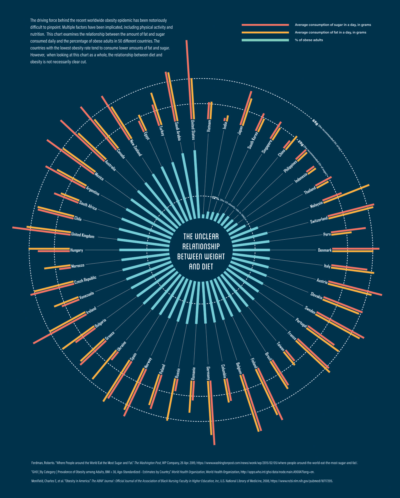
This was designed for a presentation intended to show the relationship between obesity rate and daily consumption of fat and sugar in 50 different countries. I wanted to create a graphic that could help people instantly visualize three different data points between 50 different countries while making a visual separation between the nutrition data and the obesity data. For this I settled on a radial graph sorted by obesity rate and showing that data in the center. Data on average fat and sugar consumption was shown on the perimeter of the central graph. I also included dotted guides showing the recommended daily values for fat and sugar and the U.S. obesity rate in 1990 for comparison purposes. This shows that daily sugar intake around the world often far exceeds recommended values, while daily fat intake is more moderate compared to recommendations. It also shows that a majority of the countries represented have at least doubled the obesity rate of the U.S. 30 years ago. The U.S. itself has nearly tripled that rate. This demonstrates obesity as a worldwide epidemic that is especially pronounced in the U.S.
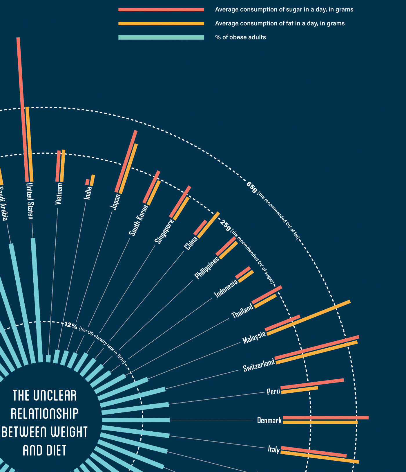
Title: The Unclear Relationship Between Weight And Diet
Year: 2019
Project Type: Data Visualization, Graphic Design, Information Design, Radial graph, Infographic
Tools: Adobe Illustrator
Year: 2019
Project Type: Data Visualization, Graphic Design, Information Design, Radial graph, Infographic
Tools: Adobe Illustrator